I have about two years of monthly blood tests. That's a lot of markers over a lot of dates. I wanted trends, not a folder of PDFs.
The schema did the heavy lifting
I store results in long format — one row per marker, per datetime — not a wide table with a column per marker. Long format means adding a new marker never changes the schema, and every chart is just a filter plus a sort. Boring, and exactly right.
Phase tagging
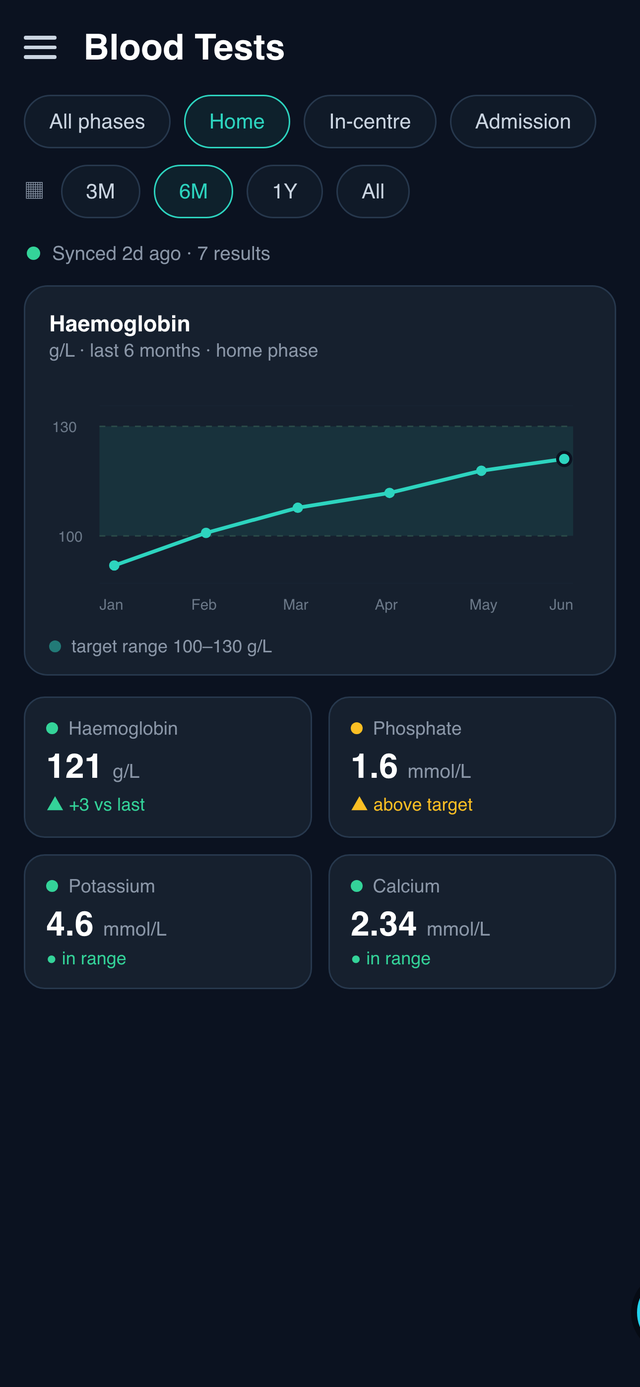
Every result is tagged with a phase: at home, in a unit, or during a hospital admission. This matters more than it sounds. A rough spell in hospital produces extreme values, and if you plot them on the same axis as steady months, the storm flattens everything else into a straight line.
Tagging the phase lets me filter those out — or look at them on their own — so the at-home trend stays readable. You can see those filters at the top of the screen above.
No LLM needed here
The source data is clean and structured, so parsing it is a regex job, not an AI job. I only reach for a model when the input is genuinely messy or the task is genuinely fuzzy. Reading a well-formatted result line is neither.
That's a habit worth keeping in any system: use the simplest thing that works, and save the model for the part that actually needs judgement. The AI assistant — coming up next in the series — is where that judgement lives.