I ended this series on the readiness score, and meant it as a close. But one tile kept nagging at me — I've sketched it and deleted it more than once — because it's the most useful number I don't currently have, and also the one I'm most afraid of getting wrong. So this is a bonus part: not something I've shipped, but a plan, and an honest account of why I haven't pressed the button yet.
The question I can only answer a few times a year
Every week I'd like to know one thing: am I actually getting enough treatment? The clinic answers that with a standard adequacy measure, taken from a blood test every few months. I wanted a read every week — and ideally from data I already log, without another needle. The catch is that a number about my own health is exactly the kind of thing you must not fake, so the whole design turned into an exercise in scoping honestly.
Why it was confusing — and how I made it simple
That measure isn't one number, and that's the trap. There's the clinic's version, which needs a blood marker measured before and after each session — data I don't have. And there's a volumetric version, which needs exactly the things the app already records: how much treatment fluid a session used, how long it ran, and an estimate of my body water.
The honest move was to stop trying to reproduce the clinic's figure. That was the source of all the ambiguity — chasing a number my data can't support. Drop that goal, scope to the version my logged data can actually compute, and frame it plainly as a personal weekly trend rather than a clinical result. The moment I let it be a different (well-defined) number instead of a worse copy of the clinic's, it became buildable.
Turning a week of sessions into one verdict
The shape is simple. A one-time profile — height, age, sex — feeds a standard formula for body water. Each session I log becomes a small adequacy figure. The week's sessions roll up into a single standardised weekly number, checked against the published target for that measure. On the home screen it's one tile you glance at — an illustrative week might read "above target" — tappable into a per-session breakdown so a weak session is visible instead of hidden in the average.
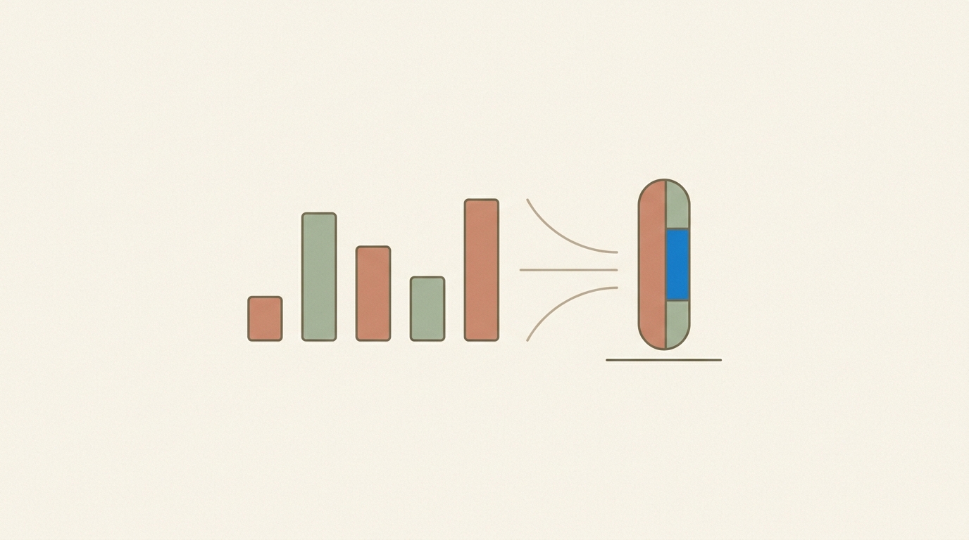
Everything it needs is already in the app. No new sensor, no new blood draw — just arithmetic over numbers I already record several times a week.
The one gate I won't skip
Here's the honest part, and it's the whole reason this tile isn't live. Buried in that calculation is one approximation I don't yet trust — roughly how saturated the used treatment fluid is with what's being cleared. I've penciled in a reasonable value, but it's a guess, and it sits right in the middle of the result. Get it wrong and the tile doesn't fail loudly; it shows a confident, wrong number about my health. That's worse than showing nothing.
The transferable bit
A number that's confidently wrong is worse than no number — especially in health, and especially when it looks tidy. So the rule for shipping this is firm: validate the one shaky approximation against ground truth (a real week checked against a known-good figure from the machine or the clinic) before it goes anywhere near the home screen. And when the data is thin — a missing session, less than a week logged — the tile says "not enough data yet," never a guess dressed up as a fact. Design the honest fallback before the happy path.
That's the whole philosophy of this app in a single tile: surface a genuinely useful signal from data you already have — but never a confident guess wearing the costume of a measurement. Whether this one ships comes down entirely to that validation week. If it checks out, it's a real weekly answer to a question I currently guess at. If it doesn't, it stays a sketch, and that's the right outcome too.
If you're building health or safety tooling where a wrong number is worse than a missing one — and you want the version that's honest about its own uncertainty — that's the kind of work I do at twentytwotensors. Get in touch.